


Data tells us a story no author could ever compose. It shows us never before observed patterns that may slip through the crack. The power of data analytics is more important than ever in the rapid-paced market, where the slightest difference is enough to save or cost a company millions of dollars in revenue. This high level of data analytics was often hidden behind layers of complex programming languages and frameworks. Still, since Tableau released its product in 2003, it has helped thousands of companies visualize billions of rows worth of data.
Tableau is a powerful data visualization and business intelligence tool that allows users to analyze and present data visually, engaging, and interactively. With a user-friendly interface, Tableau enables individuals and organizations to easily connect to various data sources, whether spreadsheets, databases, or cloud services. It offers a wide range of visualization options, including charts, graphs, maps, and dashboards, which enables users to explore data from different angles and gain valuable insights. Tableau and its lesser-known associate, Tableau Prep, provide a low-code application to import, clean, and optimize your data sources from a central data lake before using them for visualizations. In this article, we will discuss an example dataset I cleaned using Tableau Prep and then visualized using various KPIs and graphs on Tableau Desktop.
Getting to know the data
This specific dataset is a collection of datasets I found on data.gov.in. It contains data about the percent distribution and absolute number of foreign individuals that entered the country in various years (2001 - 2020), the amount of money (USD and INR) spent by foreign visitors, and area-specific domestic and foreign foot traffic. Samples of the data have been provided below, but you can download the data from these sources [1][2][3].
Year | FTAs | % distribution by Age- Group (in years) - 0-14 | % distribution by Age- Group (in years) - 15-24 | % distribution by Age- Group (in years) - 25-34 | % distribution by Age- Group (in years) - 35-44 | % distribution by Age- Group (in years) - 45-54 | % distribution by Age- Group (in years) - 55-64 | % distribution by Age- Group (in years) - 65 & above | % distribution by Age- Group (in years) - Not Reported |
2001 | 2537282 | 7 | 10.8 | 20.1 | 21.1 | 19.4 | 11.9 | 6.7 | 3 |
2002 | 2384364 | 9.2 | 10 | 19.4 | 21.6 | 19.4 | 11.5 | 7.7 | 1.2 |
2003 | 2726214 | 7.2 | 10 | 19.5 | 21.6 | 19.4 | 11.5 | 7.7 | 3.1 |
2004 | 3457477 | 8.5 | 9.8 | 18.8 | 21.3 | 19.4 | 12.8 | 8.2 | 0.2 |
2005 | 3918610 | 8.6 | 9.6 | 18.8 | 21.3 | 19.5 | 13 | 8.7 | 0.5 |
Circle | Name of the Monument | Domestic-2019-20 | Foreign-2019-20 | Domestic-2020-21 | Foreign-2020-21 | % Growth 2021-21/2019-20-Domestic | % Growth 2021-21/2019-20-Foreign |
Agra | Taj Mahal | 4429710 | 645415 | 1259892 | 9034 | -71.56 | -98.6 |
Agra | Agra Fort | 1627154 | 386522 | 371242 | 2810 | -77.18 | -99.27 |
Agra | Fatehpur Sikri | 454376 | 184751 | 107835 | 574 | -76.27 | -99.69 |
Agra | Akbar Tomb Sikandra | 229270 | 19625 | 99509 | 321 | -56.6 | -98.36 |
Agra | Mariam tomb Sikandra | 22517 | 414 | 9765 | 31 | -56.63 | -92.51 |
Year | FEE in | FEE in ` terms - % Change over previous year | FEE in US$ terms - US $ Million | FEE in US$ terms - % Change over previous year |
1991 | 4318 | NA | 1861 | NA |
2001 | 15083 | -3.5 | 3198 | -7.6 |
2002 | 15064 | -0.1 | 3103 | -3 |
2003 | 20729 | 37.6 | 4463 | 43.8 |
2004 | 27944 | 34.8 | 6170 | 38.2 |
Data Cleaning 🧹
After loading the data, the first step of any Data Visualisation Project is to clean it so that your visualizations can be neat and convey all the relevant information you extract. Of course, this is possible using Python and accessory modules like Pandas and Numpy, but Tableau Prep provides a low/no-code experience. The most you'll ever code is when writing basic SQL queries. Our complete "Data Cleaning Pipeline" is strictly no-code and, in its entirety, can be seen below.

Here, I've labeled each step to understand better what it does. Still, the basic gist includes renaming columns to more accurately portray their meaning, Altering and regrouping these columns to negate outliers in data better, and then joining the two data sources (via Inner Join) to get our final output. Below we can see one of the two final data sources.
Year | FTAs | Age % 0-14 | Age % 15-24 | Age % 25-34 | Age % 35-44 | Age % 45-54 | Age % 55-64 | Age % 65+ | Age % Not Reported | FEE in INR Crore | FEE in % Change over previous year (INR) | FEE in US $ Million | FEE in % Change over previous year (US$) |
1/1/2001 | 2537282 | 0.07 | 0.108 | 0.201 | 0.211 | 0.194 | 0.119 | 0.067 | 0.03 | 15083 | -0.035 | 3198 | -0.076 |
1/1/2002 | 2384364 | 0.092 | 0.1 | 0.194 | 0.216 | 0.194 | 0.115 | 0.077 | 0.012 | 15064 | -0.001 | 3103 | -0.03 |
1/1/2003 | 2726214 | 0.072 | 0.1 | 0.195 | 0.216 | 0.194 | 0.115 | 0.077 | 0.031 | 20729 | 0.376 | 4463 | 0.438 |
1/1/2004 | 3457477 | 0.085 | 0.098 | 0.188 | 0.213 | 0.194 | 0.128 | 0.082 | 0.002 | 27944 | 0.348 | 6170 | 0.382 |
1/1/2005 | 3918610 | 0.086 | 0.096 | 0.188 | 0.213 | 0.195 | 0.13 | 0.087 | 0.005 | 33123 | 0.185 | 7493 | 0.214 |
Time to Visualize, Visualize, Visualize 📊
Quoting Daniel Bourke, a personal hero, let's begin visualizing the data we just created. Luckily, Tableau Prep extracts can be opened directly into Tableau Desktop as a .hyper, .csv or a .xlsx file. Here we will also use our second data source, available as download file 2. Getting straight to the point, we see all our data sources and relevant column names on the left-hand pane after we import our data sources.

The names in blue are known as discrete values, while the ones in green are known as continuous values. More information can be found in this article by Tableau, but to explain with a table:
| Feature | Blue Fields | Green Fields |
| Data type | Discrete | Continuous |
| How data is displayed | Headers | Axes |
| Examples | State, Country, Product Name | Sales, Profit, Weight |
On the right of the pane, we see our workspace, where we can drag and drop our columns to create KPIs, graphs, and dashboards. I won't be going through how to make every KPI or visualization on Tableau, but we'll construct basic graphs based on the available measures and dimensions. Below are some of the more interesting plots.
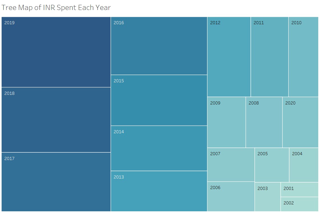
Something interesting I found was the year-on-year growth for 2001-2019, but because of the COVID-19 Pandemic, we can see the money spent in 2020 was equivalent to 2008, a 12-year deficit.
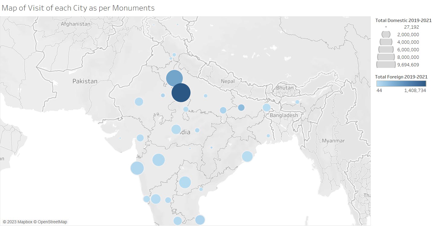
Even though Agra is 4th in terms of the number of monuments, it is the city where the most amount of foreign income is generated (because of the Taj Mehal and surrounding Monuments)
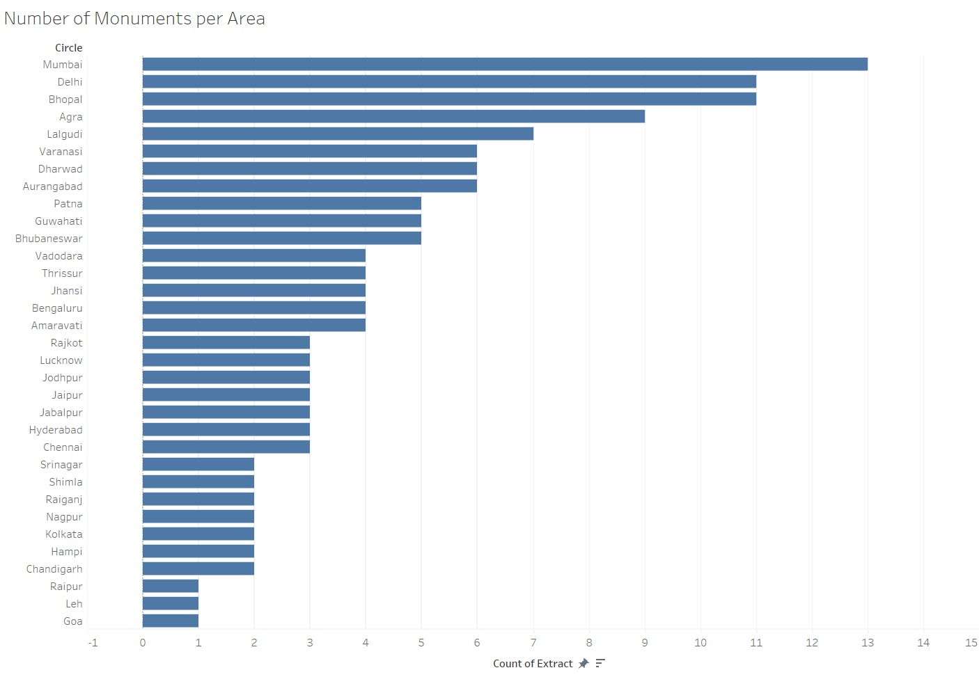
It's shocking that even though Mumbai has the highest number of monuments, its gross income from foreign and domestic tourists places it close to the middle of the total rankings.

It isn't surprising to see how strong a hold the Taj Mahal has compared to other monuments in terms of International and Domestic earnings. It is about 20% of the international income from tourism.
Final Thoughts
Tableau is a fine piece of software that makes data visualizations easy to make and, with its interactive menus, ensures that little to no code is required to complete the toughest visualizations. From simple bar graphs to parsing GeoData via coordinates or location names, Tableau can speed up the data analyzing task. It even provides ways of importing your data from Google BigQuery or Amazon Redshift. But it does lack the satisfaction of coding, which I severely missed while working on this project. The complete data visualization can be found here on Tableau Public.